
ConcertGuru
A dedicated mobile app for concert ticketing
ConcertGuru is a concert ticketing app that aims to provide users with a seamless ticket booking experience.

Project
For this case study, I designed a dedicated mobile app for a concert ticketing company. I was the sole UX designer on this project, from conception to delivery. I interviewed music-lovers who attend concerts periodically. I conducted two rounds of usability studies, compiled results, and developed a design that addressed user's primary needs.
Users
ConcertGuru targets an audience of adults between the ages of 18 and 45, who attend concerts regularly and want the option to buy their tickets online before the show.
Problem
Music lovers want an easy way to find and book tickets to see their favorite artists. Users hate hidden fees and being forced to sign up for a newsletter when buying tickets.
Solution
I built a user-friendly ticketing app for music lovers. Users search or browse to find concerts near them. The booking process is smooth and without surprises.
Tools
Figma
Google Workspace
My Role
UX research
UX design
UI design
Timeline
Overall: 10 weeks
Research: 2+ weeks
Design: 7+ weeks
Interviews
I asked concert-goers and music-lovers about their experience of booking tickets online. Users indicated that they want to be able to search for a specific artist they like or just browse artists coming to their area.
Personas
In order to develop a better understanding of the users' needs I created a persona to represent my main user group of music fans who like to book tickets in advance. Pain points included having to sign up for an account just to book and being surprised by hidden fees.
“I hate it when you go to buy tickets and you find out you got hit with hidden fees.”
Sketches
I began the design process with paper sketches to speed up the iteration process. Sketches were based on the goal of the project, competitive audits, and user research. After multiple iterations, I chose the best option.
v.1 This version had good browsing features, but did not leave room for a search bar.

v.2 This version included a lot of features, but was too busy and the pictures were too small.

FINAL The hero image gives place to showcase acts coming to your area, with a search and browse feature below.

Wireframes
I used Figma to translate my paper sketches to digital wireframes. Once I had the main screens drawn up, I added the necessary interactions to form a low-fidelity prototype.
Event Description
Users have the option to bring up the seat view, which may be helpful to the visually impaired.
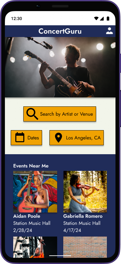
Homepage
Users can browse events or search by location, date, artist, or venue.


Confirmation
Users can see how they’ll be receiving their tickets and have optional email signup.
Payment
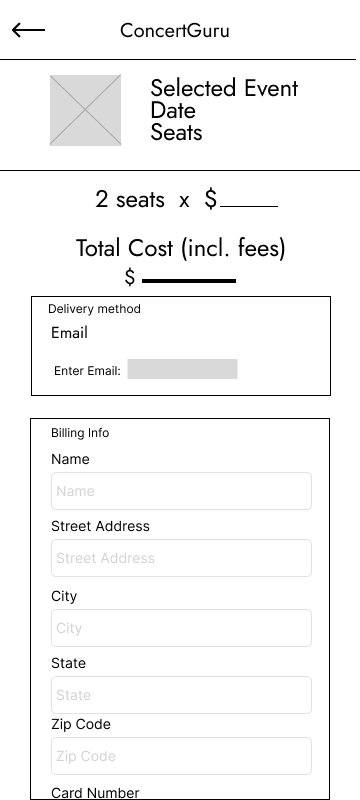
Users can easily see the seats they chose and the final price, including all fees.

Usability Studies
Round 1
To test my design, I added interactions to my wireframes so that I had a low-fidelity prototype. I recruited adults who periodically attend concerts and have booked tickets ahead of time online. I completed a moderated study, in person and over Zoom. Based on results, I identified a couple of critical issues that needed to be addressed as I moved into making mockups.
“It’s nice to be able to click on the Seat View when you’re picking your tickets.”


→


→
After round 1
I added color and a drop shadow to the search bar, plus used color to group sections on the homepage. I also added an artist description page to give users another option for searching.
Before round 1
Users had difficulty understanding the search features available.


→
After round 1
I added a popup to help users verify the accuracy of their purchase.
Before round 1
Users wanted a chance to verify their purchase before completion.
After round 1
I added error messages to show when users had missed any of the text fields.
Before round 1
Users didn’t realize when they’d missed a text field when trying to purchase.
Round 2
After adding the design elements, I created a high-fidelity prototype for another round of testing. Again, I recruited adults who periodically attend concerts and have booked tickets ahead of time online. I completed a moderated study, in person and over Zoom. Based on results, I identified one more critical issue that needed to be addressed before finalizing my designs.
“The colors really make it pop!”


→
After round 2
I added a working date range selector with changing icons. I also added a scrolling feature with more picture options to improve browsing.
Before round 2
Users continued to show frustration with the concert selection process, when not able to select specific dates.
Final Design
After feedback from the 2nd usability study, I made the necessary changes and created a final high-fidelity prototype of the product.


Next steps
The scope of this project included a single user flow, in which a user is searching for a specific artist and then purchasing tickets to that show. The final design works well for this purpose. As this was my second UX project, I didn’t have the time to learn how to add all the accessibility features I would have liked. As my experience grows, I hope to add more of these features to future projects.
01
Determine if the app is functional for a different user flow, such as when users are browsing preferred genres for concerts in their area.
02
Conduct user interviews as a follow-up to usability studies to see if any other problems, not first identified, exist with the design.
03
Add Alt-Text to images to increase accessibility for users with screen readers.
Takeaways
This project taught me how to run a successful usability study. I learned how to prep users who will be testing and how to be clear in my instructions. I found the date picker and mockup frames on Figma’s Community page, which helped significantly. I learned how to use Google’s Material Design icons to produce consistent iconography. When iterating on my design, I struggled to make minor changes across multiple screens. After finishing, this project motivated me to learn how to build my own components to simplify my design process in the future.
Thank you for reading my case study!
Want to work with me? Contact me!
kdcollins101@gmail.com
(310) 929-0650
