
Stanley’s Diner
Responsive online menu
Project
I designed a responsive online menu for a mock restaurant, named Stanley’s Diner.
Problem
Users need a way to access the restaurant’s menu from home and the restaurant, using various devices.
Users
The target users are 55+, who eat out regularly, and may or may not have dietary restrictions.

Solution
I designed a responsive website which gives users the ability to sort and filter dishes by price and ingredients.
Tools
Figma
Maze
Google Workspace
My Role
UX research
UX design
UI design
Timeline
Overall: 6+ weeks
Research: 2 weeks
Design: 4+ weeks
“Sometimes, it’s so hard to find the menu. And then when you do, it doesn’t show the prices.”
Interviews
After a competitive audit, I interviewed sample users over 55 who ate out regularly. During interviews, I discovered one user, a vegan, who explained how difficult it is for her to find dishes she can eat. While designing this product, I kept users with dietary restrictions in mind.
Personas
I decided to develop personas to better empathize with users who struggle with dietary restrictions. I developed a persona of a user who is over 55, likes to eat out, and is vegetarian. The pain points were having trouble seeing prices, pictures, and finding dishes that were within their specific dietary needs.
“It’s hard to find things I can eat. Most menus have the little icon to show vegan dishes, but not always.”
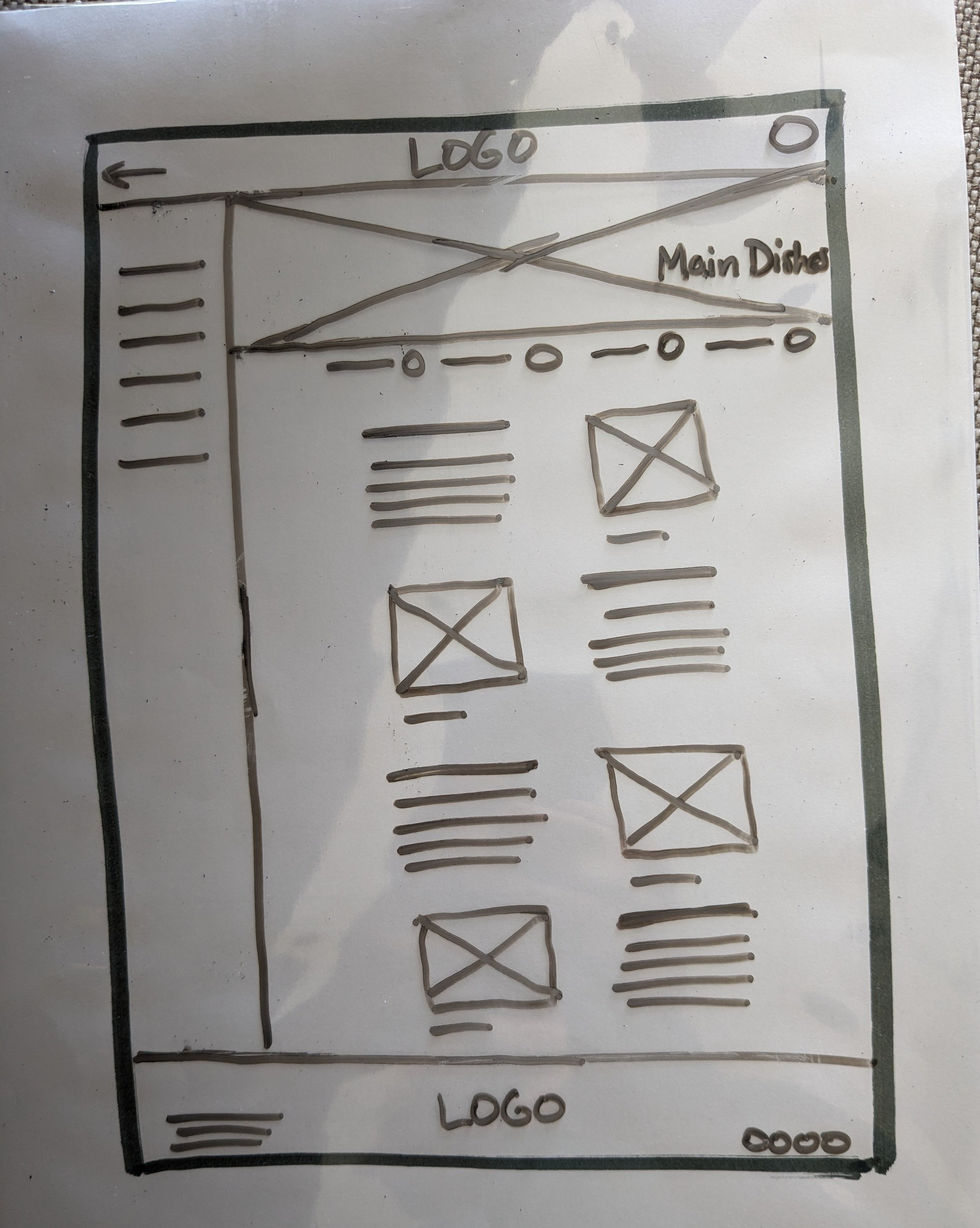
Sketches
I started with paper sketches to allow for rapid iteration. I iterated on each of the main screens several times, before deciding on which design features best met the user's needs.
In the desktop version, I decided that a sidebar menu of food categories along with filter options across the top would make the most sense to users.
v.1 Menu sorted by folders. This design was a little too text-heavy for older users who may require magnification.


v.2 Menu categories divided by lines. This design had more pics, but the sorting features may have been confusing.
FINAL The banner image for each category helps limit reading required, and the filter options would remain in prominent location.
Wireframes
I used Figma to translate my paper sketches of the desktop website into digital wireframes.
Desktop version

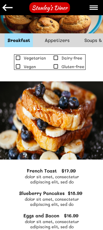
Mobile version
I used a horizontal scrolling menu at the top, keeping the banner image at the top for each category. I added an outline and divider to keep the filter options prominent.

Usability Testing
During testing, I wanted to know whether users would be able to easily navigate the menu to find specific types of dishes, with pictures and prices. For example, I asked users to “find a dessert that is dairy-free under $20.” I recruited adults over 55 who eat out regularly and included two users with dietary restrictions. I completed an unmoderated remote study, using an online user testing platform called Maze.co.
“It’s nice to be able to go straight to the different parts of the menu.”
Insight #1
Users weren't aware that they could click on menu items to get more info.
Solution
I included item descriptions just under titles of dishes to eliminate an extra click.
→

→
Solution
Mobile food menu. I added strong boundaries around the horizontal scrolling menu to help users understand this feature more quickly.
Insight #2
Mobile food menu. Users had trouble understanding how to access the horizontal scrolling menu, along with the dietary filters.
Mockups
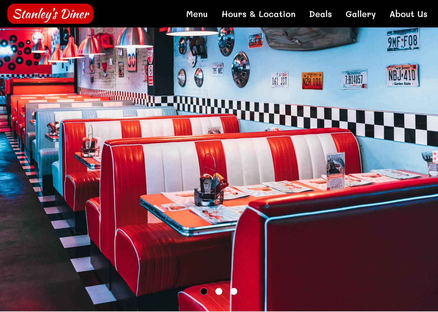
Desktop


Mobile


Final Design
After using the insights gleaned from the usability study to make changes, I turned the final design into a high-fidelity prototype for future testing. I used a nostalgic color palette and typography consistent with the 1950’s aesthetics to appeal to the target user.
Next steps
As this was a case study, I did not have the time to conduct a second usability study on the hi-fi prototype, which might have helped identify any other usability issues. Also, as this was a mock restaurant, I didn't have feedback from the restaurant owner to ensure the design can be maintained over time. Although users were thrilled with the design, I would need buy in from the restaurant owner to ensure the information online stays updated, as the menu changes.
01
Interview local restaurant owners to determine how receptive they would be to starting and maintaining an interactive menu on their websites.
02
If this had been a real project, I would want to find out if the online menu achieved the goal of attracting and retaining new customers.
03
Conduct further usability testing under different lighting conditions, like a sunny restaurant patio, and with users with low vision.
Learnings
In this project, I learned how to incorporate more components into my designs to help streamline the iteration process. This project taught me the importance of being open-minded and listening during user research. As I do not follow a strict diet myself, I was surprised by how difficult it is for people with dietary restrictions to find a suitable restaurant that meets their needs. By keeping an open mind, I was able to shift gears and include this information in my design.
Thank you for reading my case study!
Want to work with me? Contact me!
kdcollins101@gmail.com
(310) 929-0650

